RECEIVE 10% OFF YOUR FIRST ONLINE ORDER

SIGN UP HERE

Search

Trend Report: Exclusive Prints for Autumn and Winter 2024

As a fashion business owner, it’s important to anticipate what your customers will be shopping for each season. To help you plan your autumn and winter collections, we’ve conducted colour and pattern research to design a range of on-trend exclusive prints. Informed by runways and fashion forecasting, these prints have been designed in-house by the Global Fashion House team and are ready to be stocked in your store.
 

As a fashion business owner, it’s important to anticipate what your customers will be shopping for each season. To help you plan your autumn and winter collections, we’ve conducted colour and pattern research to design a range of on-trend exclusive prints. Informed by runways and fashion forecasting, these prints have been designed in-house by the Global Fashion House team and are ready to be stocked in your store.
As a fashion business owner, it’s important to anticipate what your customers will be shopping for each season. To help you plan your autumn and winter collections, we’ve conducted colour and pattern research to design a range of on-trend exclusive prints. Informed by runways and fashion forecasting, these prints have been designed in-house by the Global Fashion House team and are ready to be stocked in your store.
 

Colour Trends

Neutrals

Our research indicates customers will have a particular interest in familiar and subtle shades.

For this reason, neutrals like black, white, cream, grey, and beige will be popular – as they almost always are in the cooler months.

Chocolate

There’s something inherently comforting about wearing warm brown, taupe, and tan shades in autumn and winter.

Whether it’s a reminder of falling leaves or hot chocolate, these hues are often the annual sign that cold conditions are on their way.

Muted Colours

Even if the weather is a little dull, it doesn’t mean customers want their wardrobe to be. Muted colours and mid-tones are excellent for this time of year, when the climate calls for cosiness and softness. Neutrals contrast beautifully with toasty browns, reds, and oranges, while earthy green and the occasional burst of inky blue are reminders that warm weather will be back again soon.

Print Trends

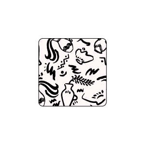
Art Abstract

Inspiration: gestural marks, paint blobs, spontaneous brushwork, pattern movement, abstract marks, rich pigments, freeform patterns, blur and scribble.

These prints suggest a sense of creativity, movement, and freedom. This theme is reminiscent of modern art, where simplicity and ease are part of the vision. These designs have a purposefully muted colour scheme, allowing the linework and colour contrast to be the focal points.

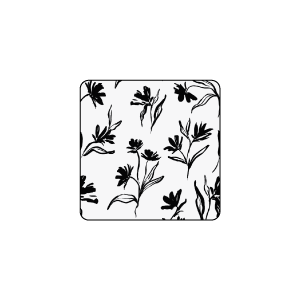
Illustrated Floral

Inspiration: monoprint flower drawings, tonal colour work, simplified flora, linear drawings, expressive ink foliage, bleach-out foliage, solid and linear combinations.

This theme provides a fresh take on floral. There is an emphasis on elongated leaves and stems, rather than classically round petals. Compared to springtime floral fabrics, these prints are noticeably more neutral. The colour palette gravitates towards black, white, and cream – true to the spirit of botanical drawings.

Secluded Garden

Inspiration: glowing florals, crowded flower gatherings, tropical houseplant worlds, glow-in-the-dark botanicals, night-time garden, dark foliage with brightness.

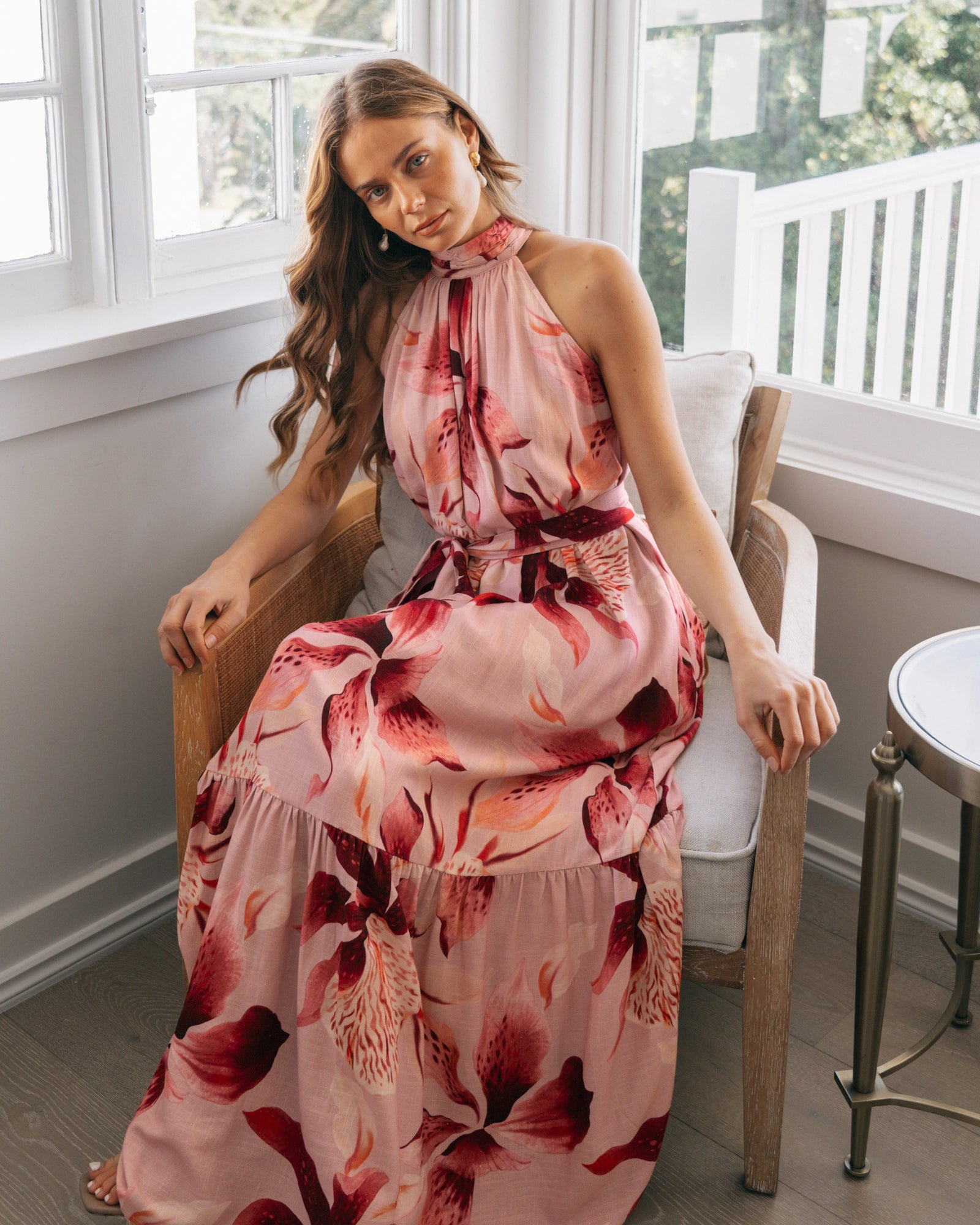
These prints are a departure from flowery fabrics with pastel colours. The colour scheme is based around neutrals and muted colours, with some brighter shades to add a subtle warmth to these prints. This theme contrasts delicate wildflowers from meadows with luscious tropical flora to reflect variation in the botanical world.

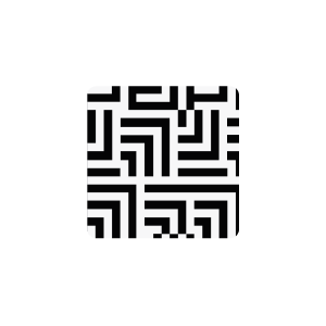
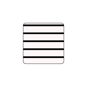
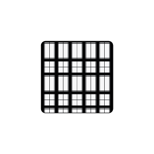
Hatchings

Inspiration: shadow cross-hatched marks, irregular dashes, fine brush dabs, hatched mark making, plaid hatchings, chevron and zig-zag lines, abstract marks and dashes.

This theme takes cues from check, plaid, and tweed designs, offering lines without the rigidity. Although these prints have a slightly hand-drawn look, there’s a steadiness and smoothness which give them an even, consistent appearance. Colours like off-white and brown provide an unexpected twist on traditional black-and-white stripes.


Circular

Inspiration: circles, overlapping spherical, linked rings, oval blobs, rounded smudges, shadowed daubs, morphing blots, layered discs, blotched rounds.

These prints are an alternative to polka dots, with symmetry being central to this theme. Geometric lines contrast with circular shapes; sharp angles softened by rounded edges. This idea also extends to the colour palette with yin-yang-like designs. Neutrals combine with colour, while black and white are a timeless example of balance.